
Friday – May 15
As already discussed in the first part of this blog which you can read at https://lagencypro.com/blog/flexbox-a-one-dimensional-model-of-layouts/ Flexbox is a powerful CSS tool which allows us not only to control the position of our components in a single dimension but also their behavior in different situations. In the current installment we are going to explore some of these behaviors under different environments.
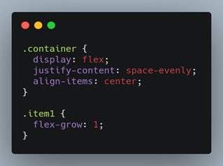
First, we are going to set up a simple project in which we are going to show different properties.

The first property that we are going to see today is flex grow, this property allows us to tell each of the items inside the container how much they are going to grow with respect to the others on the main axis of our container. By default, this property is 0 for each one, so they only occupy the space needed to display its contents, but if we add flex-grow :1 to our item1 this will begin to have priority over the other items.
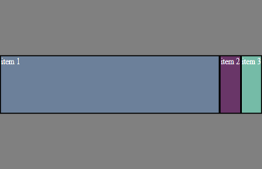
As you can see, the priority is now on our item1, but what happens if we add the same property to items 2 and 3?
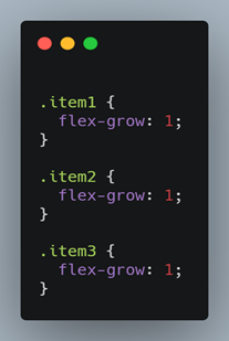

As you can see, our items are now equally distributed, each one occupying the same length as the others. If you have paid enough attention, you will have noticed that we are using only the value 1 in all the items, and you will probably assume that is why they are all the same size, so now let’s apply different values to each one and see what happens.
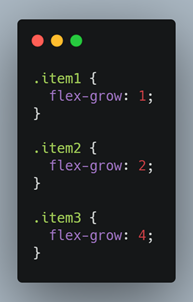

Now all our items have different sizes, if we analyze a little bit this behavior is quite easy to understand. First, we are going to add all the values that we defined in our flex-grow in the following way, 1+2+4 = 7. If we separate the length of our container in 7 parts on the main axis as seen in the image, we can notice that each of our items occupy a number of divisions equal to our value entered as flex-grow (in the case of item 1 occupies 1 division, item 2 occupies 2 divisions and item 3 occupies 4 divisions) But it is also important to note that this size is not exact, because it can vary depending on the content of our items.
Flex Grow, can become one of the most useful tools you can find when it comes to layout designs, this, despite being quite specific, allows us to manage the behavior of our one-dimensional model in a very different way as we would do with justify-content, expanding the control we have of our graphical interface and making it more customizable.
But that’s not all that flexbox contains, there are still more useful features which will be present in the next installment.

Diego Cañon – FrontEnd Developer