
Monday – May 24
This is a very common question when we are learning CSS, we find the concept alignments in CSS and we don’t suddenly know which one to choose. Before knowing which one is better to use, we must know the concept of each one of them.
Flexbox was designed as a one-dimensional layout model and it helps to distribute the space between the items in an interface and improve the alignment capacity.
On the other hand, Grid offers a design system based on grids, with rows and columns, which makes the design of complex components easier.
Knowing the concepts of flexbox and grid we can say that flexbox is more appropriate for the components of an application and small-scale designs.
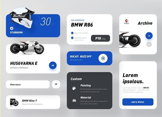
As we can see in the image, this is a very simple design, therefore it is appropriate to use flexbox.
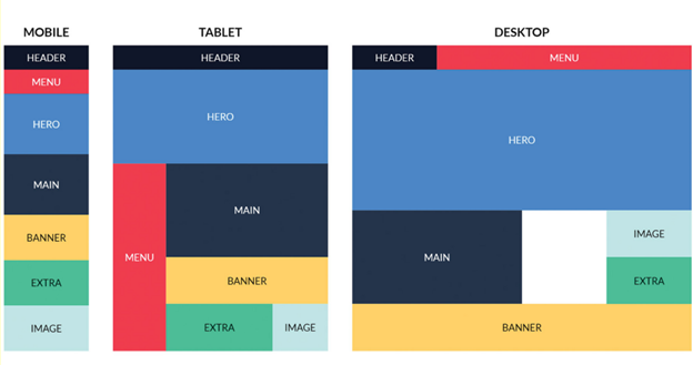
On the other hand, CSS Grid is oriented to large-scale designs, that is, how is the design of a layout, facilitating the organization of the components of a layout in multiple devices as we see in this image
However, there is not really a rule as such if we must use one or the other we can even use both to make our layout, but it is important to have a good decision when choosing since taking this into account we can do things a lot easier.

Job Coronado – FrontEnd Developer