
Thursday – January 13
In the world of web development, it can be easy to maintain a pleasant view between different resolutions when it comes to monitors sizes, but things are a little different when it comes to mobile devices since these do not have the same proportions as a monitor and it is necessary that our interface is capable of adapting to these changes, especially in an age where mobile devices are gaining more and more ground.
Following, we are going to see how it is possible to use media queries in our styles to make our interface adaptable to the current device.
For this case, I have decided to build a sidebar since these can be where the changes are most noticeable between platforms.
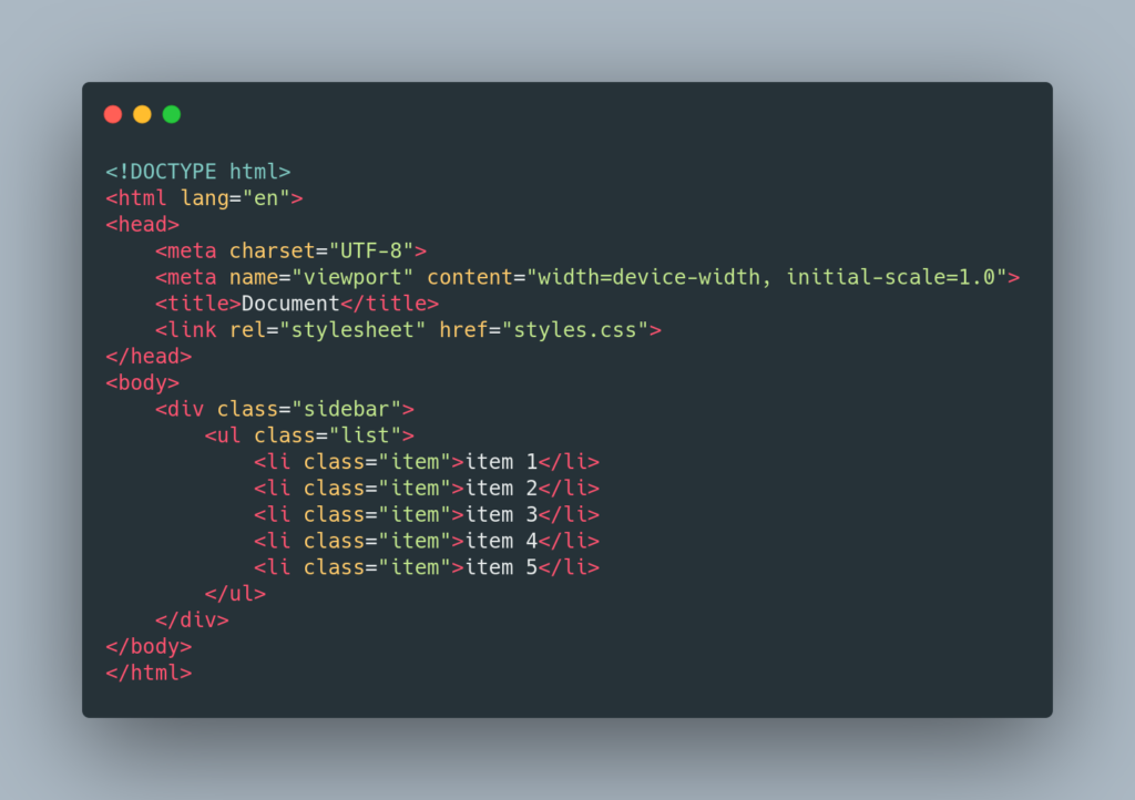
Thanks to this structure we will be able to structure in a simple way a sidebar that contains 5 items
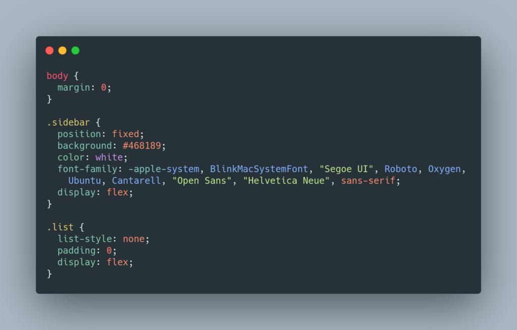
The above are generic styles that will be present in both views, this allows us to write less code and make it easy to maintain since we can change properties that will be present in many views just by modifying a few lines.
The property display: flex property is not very useful until we start to apply justify content and align items, but later it will be key, since this property allows us to edit how we have our layout in one dimension and its applications can be very useful, so I recommend you learn how its different options work once this guide is finished.
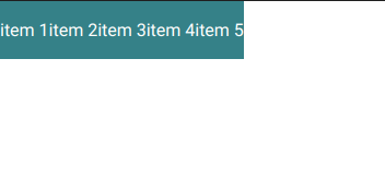
So far this is what our sidebar looks like, kind of boring right? Well, now we will begin to apply the corresponding styles to a cell phone view.
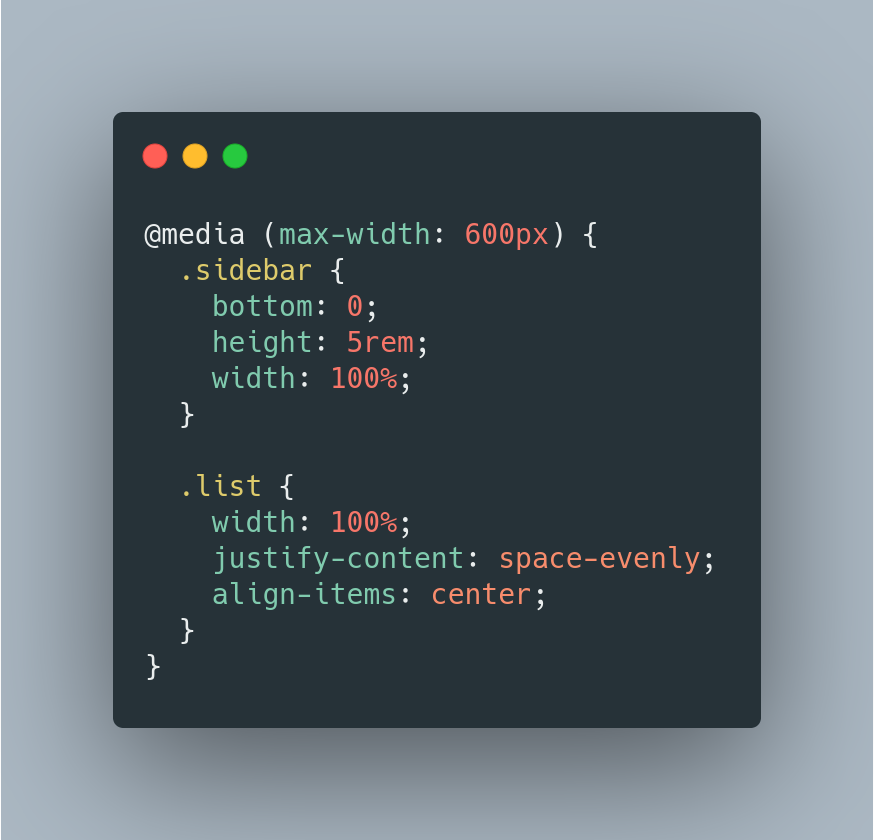
As you can see, these styles are enclosed by an @media, this block allows us to define a rule, which if it is fulfilled will allow the styles contained in it to be carried out.
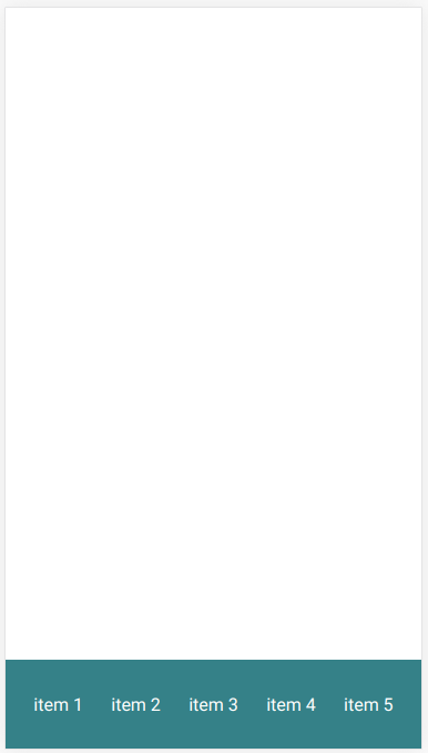
And this is what our mobile view looks like, thanks to justify-content: space-evenly; we can make our items are evenly distributed along our sidebar, and thanks to position: fixed; This will be at the bottom of our screen even if we scroll.
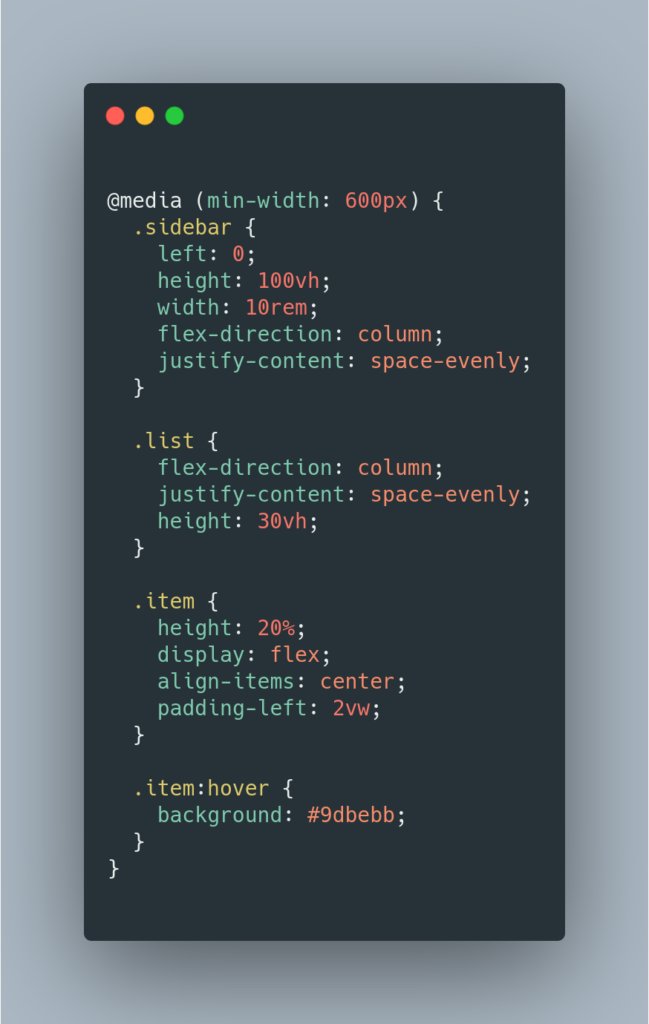
And this is how our media query was for screens with a width greater than 600px, in this view we have made more use of the other classes, this mainly due to interactions with the mouse thanks to the use of the pseudo-class: hover which allows executing certain styles when the mouse is over a certain component. Furthermore, our components are no longer located next to each other but vertically thanks to the use of flex-direction: column; a property of flex which by default has the value of row.
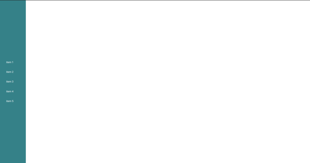
And this is the result of how it looks from a 16: 9 monitor
Likewise, as media queries have been used, for only 2 different sizes it is possible to use as many media queries as we want to adapt to all possibilities such as tablets, ultra-wide screens, among others.
Hope this information be useful to comprehend how to build a RESPONSIVE SIDEBAR WITH HTML AND CSS.
We encourage you to continue reading more about the subject if you are interested, also join the mailing list to know when we publish more content. or even if you interest to build a project with our team write to us we will love to reply and work together.

Diego Cañon- FrontEnd Developer