
Wednesday – February 17
Flexbox is a CSS tool that allows us to distribute the elements of a container, their address, and the way they will behave. In order to implement it, it is necessary to put it as the display of our container component using display: flex. By default, this property will set our items to be arranged horizontally (row), but we can change this through the flex-direction: column; This property will allow us to alter the main axis and the cross axis of our component, which are crucial to understanding how flexbox works.
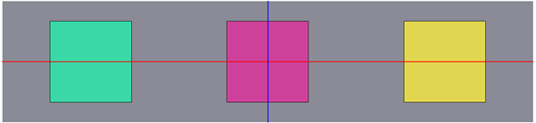
Imagine the axes as lines that cross our component horizontally and vertically, if our flex-direction is row then our main axis will be horizontal and our cross-axis vertical, but if our flex-direction is column then our main axis will be vertical and our horizontal cross-axis, this will be easier to see through an image:

In this case, our flex-direction is a row, so our main axis is the red line and our cross axis is a blue line. In this case, if we position items inside our container, they will be organized horizontally.
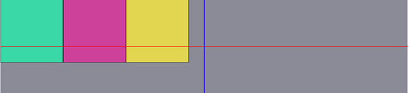
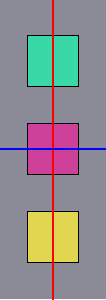
These components are positioned at the beginning of our container because we have not told them yet how we want them to behave, if we want them to be centered with respect to our cross-axis we can do so by using align-items: center; Which will make these items are on our red line.
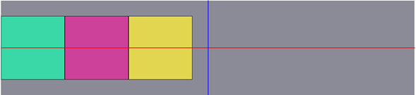
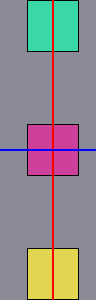
Just as we tell align-items to position the items in the center of our cross axis, we can also tell it to position them at the beginning align-items: flex-start; or at the end align-items: flex-end;
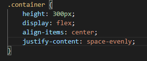
Next, comes the property that you will surely use the most together with align-items, this is justify-content. This allows us to organize our items on the main axis, but this one, having more than one item on its axis, we can apply some extra options which will make our work much easier. These 3 options are very similar and you can select the one that is most useful depending on what you consider convenient.
The first is justify-content: space-evenly; space evenly is a property that allows us to maintain the same distance between each of our items and around them, this is easier to see through an example:
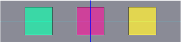
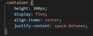
Now, what if we want to eliminate the space from the edges and make this space evenly and to be distributed only between the items? Of course, the justify-content: space-between; It allows to do it in a very simple way:
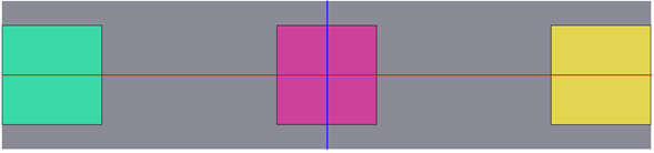
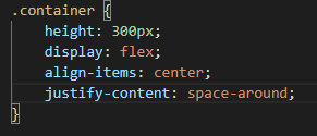
Finally, something a little more specific, and if we want the space around the items to be the same? Of course! With the justify-content: space-around option; it is also very simple:
And the best thing is that these same options can be applied vertically if we put the option flex-direction: column;

Up to this point, we can only say one thing: “Flexbox is a great and very useful tool to be able to position our items in a single dimension” And what still needs to be covered! But the latter will be for another time.

Diego Cañon – FrontEnd Developer